Email Design Best Practices That Deliver Results

A simple approach to designing marketing emails is often the most effective. Fewer assumptions, more clarity, and real constraints lead to better results. This guide shares the email design best practices that consistently help campaigns look sharp, load quickly, and convert. Think of it as a working playbook for your team, covering everything from strategy to sign-off.
The case for email design best practices
Great offers underperform if the presentation fights the reader. Clear design removes friction. Clear design supports accessibility and deliverability. Clear design drives more clicks with less noise. When we say email design best practices, we mean a set of decisions that help more subscribers understand the message on the first scan and act without effort.
The foundation is a master template system
Your fastest wins come from a master template that locks down reusable parts.
Header with logo and a short eyebrow
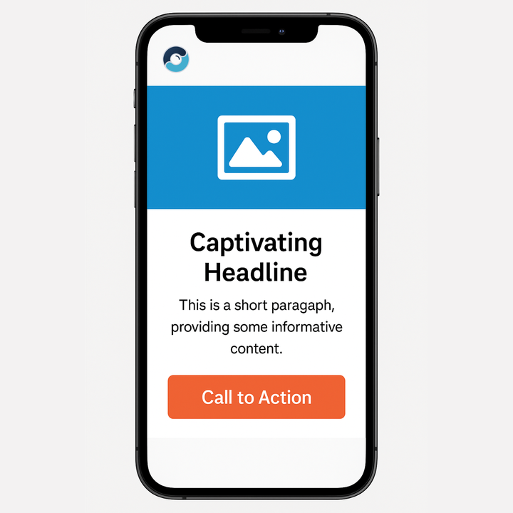
Hero block with headline, supporting line, primary CTA
Flexible body modules for product tiles, feature callouts, testimonials, and FAQs
Footer with social icons, company details, and a visible unsubscribe
This is the first of our email design best practices because consistency reduces cognitive load. It also makes testing faster because only one variable changes per send.
Mobile first and responsive from day one
Most opens happen on a phone. The layout must read cleanly on a small screen without pinch and zoom.
One column layout for most messages
Generous line height and type sizes that are legible on small screens
Tap friendly CTAs with ample padding
Images that are compressed and sized for common device widths
If it does not work on the phone in your hand, it does not ship.
Hierarchy that respects attention
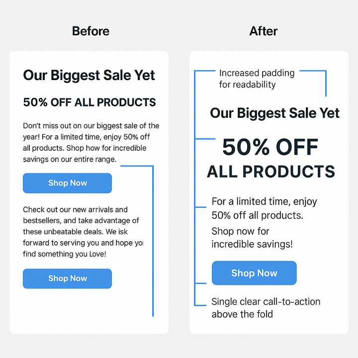
Readers scan first and read second. That means the design must guide their eyes in a logical sequence that supports your intended outcome. A clear visual path helps ensure subscribers understand what’s most important right away - whether the goal is driving conversions, collecting signups, encouraging contact, or prompting a purchase. Whatever the objective, structured hierarchy gives the email direction and purpose.
The simplest structure to achieve this looks like this:
A headline that carries the core value in one short, impactful line
A supporting sentence that clarifies the offer and reduces hesitation
A primary call-to-action (CTA) that uses clear, action-driven language
Secondary details below for readers who want more context before acting
By sticking to this hierarchy, you create a natural path that moves readers from interest to action without overwhelming them.
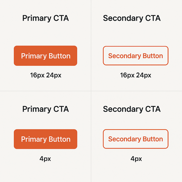
CTAs that earn the click
Buttons should always look like buttons, and links should be instantly recognizable as links. Labels must set clear expectations, telling the reader exactly what will happen next.
Focus on one primary action per email whenever possible
Add a secondary action, like “Learn more,” only if necessary
Use live text for buttons instead of text embedded in images
Ensure strong contrast and generous padding so buttons are easy to read and tap on any device
Position the primary button above the fold so it’s visible without scrolling. This is one of the most reliable email design best practices, and it consistently delivers results!
The image to text ratio that keeps you out of trouble
A simple starting point is around 60 % live text and 40 % images. Image only emails are hard to search and can hurt deliverability. Text only walls are hard to scan and easy to skip. The ratio is guidance not dogma. You still need alt text on every image and you still avoid putting critical information inside images.
This balance is central to email design because it improves both accessibility and performance.
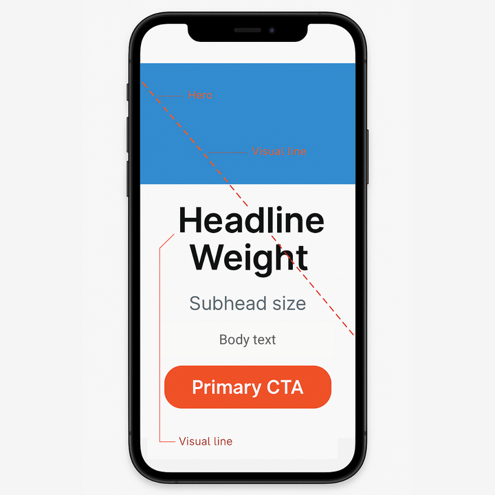
Typography that reads cleanly everywhere
Choose one primary font and a reliable fallback and keep the overall palette tight for consistency.
Headlines should be bold enough to stand out on mobile, yet scale gracefully on desktop
Body copy must remain in the comfortable reading range, avoiding text that feels cramped or oversized
Limit yourself to two or three font weights to maintain clarity and visual balance
Always ensure strong contrast between text and background for maximum readability
Remember, font choice alone should not be the sole expression of your brand. Layout, hierarchy, and language carry just as much weight. Following this approach keeps your email design effective. Even in older or less flexible email clients.
Recommended Web-Safe Font Pairings for Email
Typography can set the tone for your entire message. Since not all email clients support custom fonts, it’s important to rely on web-safe fonts that render consistently across devices. Pairing a strong headline font with a clean, readable body font is one of the simplest ways to apply email design best practices in typography.
Accessibility that includes everyone
True email design always includes accessibility. Every subscriber should be able to understand and act on your message. Making accessibility part of your email design best practices strengthens engagement and ensures your campaigns reach everyone.
Add purposeful alt text so images communicate meaning even when they don’t load
Write clear, action-driven link and button labels instead of vague terms like “click here”
Maintain strong color contrast to keep text legible in any environment
Use live text instead of image-based copy so content works with screen readers and inbox search
Accessibility should be a standard checkpoint in your workflow. When built in from the start, it improves both the user experience and the overall performance of your emails.
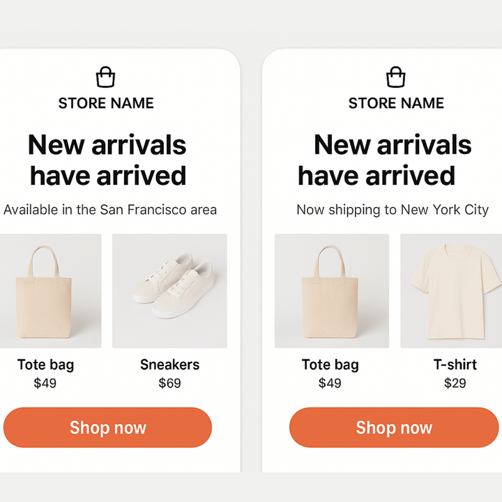
Personalization that is useful not cute
Personalization is not just a first name. Show relevant products. Show local dates. Show contextual content.
Product blocks that reflect recent browsing or purchase history
Content that adapts by country or language
Copy that references lifecycle stage such as new subscriber or active customer
Relevance raises attention. Attention raises clicks. Clicks improve reputation.
Content Modules That Mix and Match
One of the most efficient ways to improve both quality and speed in email production is by building a library of reusable content modules. Instead of designing every campaign from scratch, you can assemble emails using pre-tested blocks that already align with your brand and follow email design best practices.
Common modules include:
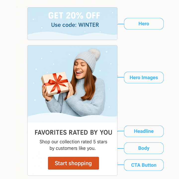
Hero section
A hero section pairs a striking image with clear text to grab attention immediately and communicate the core offer at the top of the email.
Testimonial block
A testimonial block includes a customer avatar and short quote to build trust, reduce hesitation, and support conversions through social proof.
Feature trio
A feature trio highlights three key benefits with icons and short descriptions, making it easy for subscribers to scan and understand your value proposition.
Product grid
A product grid showcases multiple items with prices and clear call to actions, helping to drive clicks and purchases in promotional or eCommerce emails.
Event block
An event block presents the date, time, and a registration button in a clean format, making it simple for readers to save the details or sign up quickly.
CTA banner
A CTA banner repeats the main action such as “Shop now” or “Register today” at the bottom of longer emails to capture readers who scroll all the way down.
Recommendation block
A recommendation block displays personalized product or content suggestions based on a subscriber’s past behavior, increasing relevance and driving higher engagement.
By combining these elements, teams can quickly tailor layouts to different goals such as launching a new product, sending a seasonal offer, or sharing a company update without reinventing the wheel each time.
Module libraries turn email design best practices into a shared language between marketing, design, and development. They create consistency, reduce errors, and allow more time to focus on strategy and content rather than production details.
Design Choices That Support Deliverability
Deliverability should always be considered part of your email design best practices. Even the best-looking campaigns fail if they never reach the inbox. Small design and technical decisions can make a big difference.
Keep the email weight lean so it loads fast and avoids being clipped in Gmail and other clients.
Avoid very tall images that can stretch layouts and trigger spam filters.
Align subject lines and preview text with body content so expectations match the actual message.
Send from a domain with a strong reputation and maintain consistent sending volume to build trust over time.
Authenticate your domain with SPF, DKIM, and DMARC to protect against spoofing and prove legitimacy to mailbox providers.
With MyLINK MarketingPlatform, authentication is built into the setup, with DKIM signing and domain alignment handled. The platform also helps you manage sending reputation, monitor volume, and keep emails lightweight, so design and deliverability work together from the start.
Making the most of your email footer
A footer is more than just the legal end of an email. Done well, it can reinforce trust, support compliance, and even show a bit of brand personality without distracting from the main message.
Include a clear unsubscribe link so readers can easily manage their subscription.
Offer a preference center link to give subscribers control over the type and frequency of emails they receive.
Add your physical address and company details to meet legal requirements and build credibility.
Use social icons that are easy to tap so readers can connect with your brand across channels.
Highlight ratings or review platform badges such as Trustpilot, G2, or Google Reviews to reinforce credibility and show social proof at the close of your email.
A thoughtful footer closes the email on a professional note and shows respect for your audience. That combination of compliance, usability, and personality makes it a key part of your email design best practices.
Testing That Drives Continuous Improvement
Never rely on guesswork. Testing is the only way to know what truly works. Each experiment should be simple, measurable, and repeatable so design decisions turn into proven patterns.
Run A/B or split tests on a single element at a time such as a CTA label, subjectlines, button color, or hero image.
Measure results with clear success metrics like click through rate, conversion rate, or revenue per recipient.
Document outcomes in a shared log so the entire team can learn from past experiments.
Apply winning results to your master template to raise the baseline quality of every future campaign.
A consistent culture of testing is the engine behind effective email design best practices. It transforms personal opinions into evidence and ensures every design choice is backed by performance data.
A workflow that builds momentum
A clear process helps teams stay focused, move quickly, and avoid last-minute mistakes. Following a structured workflow turns email design best practices into a repeatable routine.
Define the single goal for the email so every element supports the intended action.
Draft the headline and the CTA before visuals to lock down the core message.
Select the closest master template and the minimum modules needed to tell the story.
Write concise copy that earns the click and supports the main action.
Source or design images that clarify the offer without adding unnecessary weight.
Add accessibility details and run a contrast check to ensure every subscriber can engage.
Test on real devices and common email clients to catch rendering issues.
Send a proof to a teammate who has not seen the draft for a fresh review.
Log the final variant and results so learnings are captured for future campaigns.
Common mistakes to avoid
Even well-planned emails can lose impact if small but critical mistakes slip through. This table highlights frequent pitfalls in email design and how to fix them, keeping your campaigns aligned with email design best practices.
A simple checklist or this table printed next to your builder can prevent these issues. Small mistakes are easy to avoid when they are visible, and avoiding them keeps emails clean, accessible, and effective.
Bringing It All Together
Email design is about clarity, accessibility, and guiding readers to action. By following these email design best practices, every campaign becomes easier to read, faster to load, and more likely to convert.
MyLINK MarketingPlatform makes this process even simpler. With ready-made templates, modular design blocks, built-in testing, and domain authentication handled, the platform ensures best practices are applied consistently while saving time for your team.
When the right practices meet the right platform, email marketing becomes more effective, more reliable, and far easier to manage.
Did you find the article and topic interesting?
If you would like to explore the subject further, discuss ideas, or understand how it could apply to your business, we are here to continue the conversation.